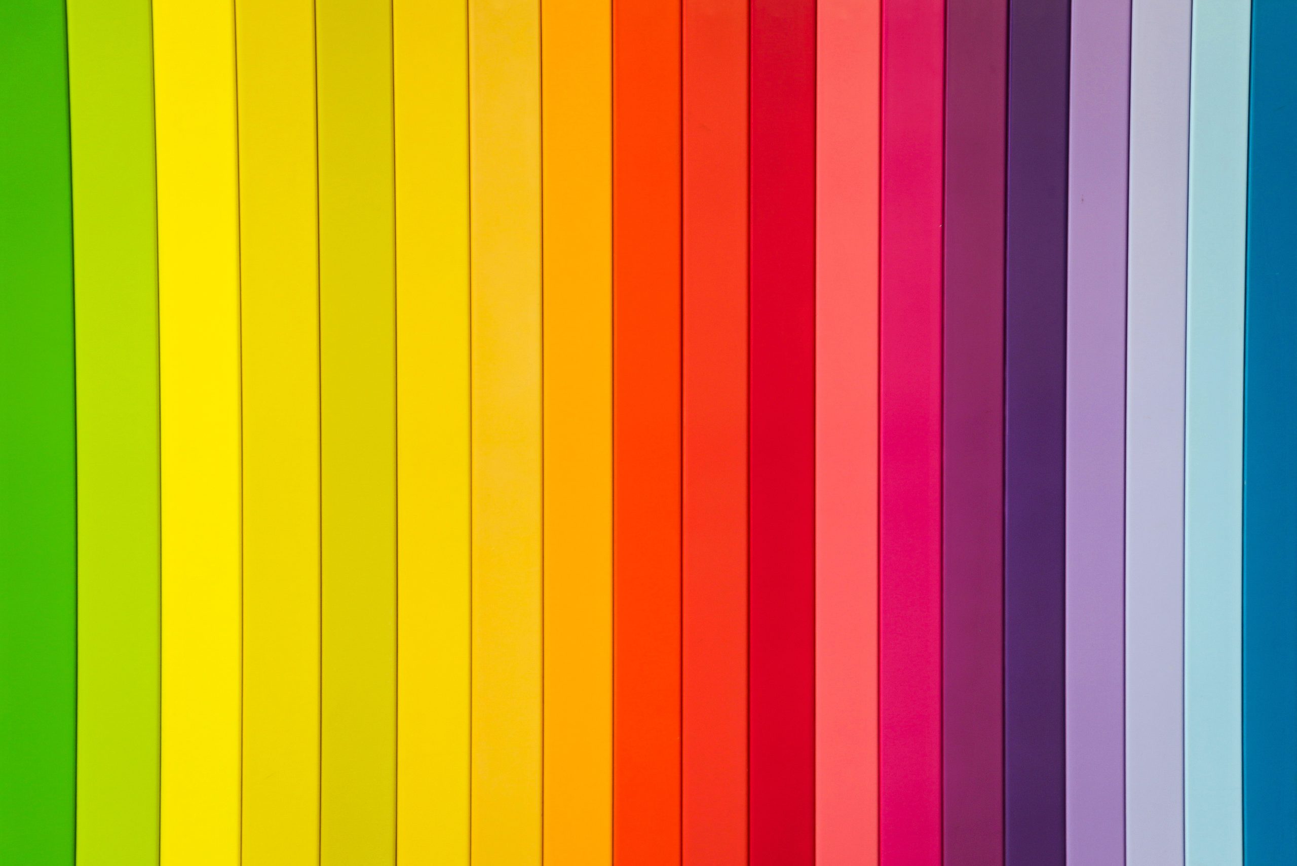
 Graphic Design
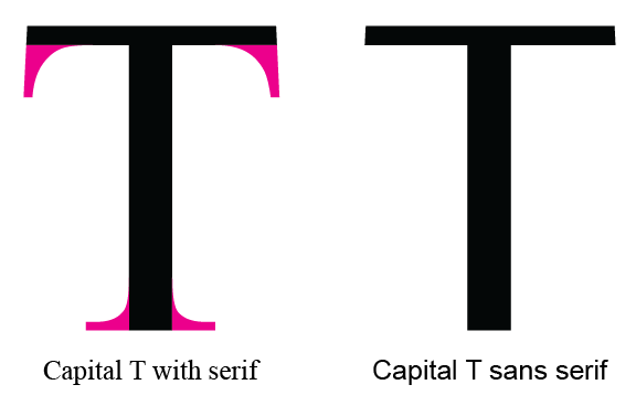
Serif versus Sans Serif fonts
You may have seen some fonts in your Microsoft Word styles labeled as “sans serif.” But did you ever stop to think what that means? A serif is a small flourish on the ends of letters in a font. If the font doesn’t employ these small calligraphic embellishments, then it is sans serif, or without serif.
The two most well known examples of each type of font are:
- Serif – Times New Roman
- Sans Serif – Arial
It may not be imperative to know this definition, but it can help you with some basic type-setting or stylistic determinations. An easy way to make printed words look good (or blocks of text on a web page) is to alter the headings and the body text between two similar fonts – one with and one without serifs. For example, two geometric fonts that use very circular letters can be used together if one has serifs and the other does not.
The addition of the font flourishes is just one designating feature of a font. The size, shape, weight, and style of the font all factor into the final look – but also whether two fonts will look good together. Similar fonts with just one attribute different between them pair harmoniously for the reader. If they differ in 3 or 4 different ways they cease to be pleasing to the eye and can even be distracting to the reader.
The next time you go to add text to a document, a webpage, or even a social media graphic, ask yourself if adjusting the serif between paired fonts will get you a more professional and pleasing look.