 Graphic Design
Responsive Logo Design
You hear a lot in web design about responsive websites. A responsive website responds to the size of the screen viewing it. It may shift elements, change sizes of text or images, or drop elements completely from smaller phones.
What if you could do the same thing with a responsive logo?
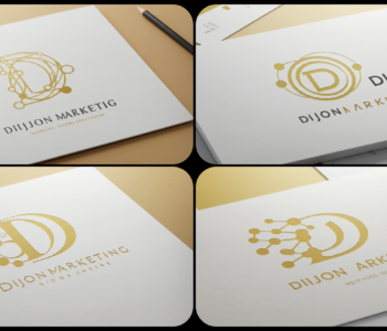
Let’s take an example of Dijon Marketing. If I designed a letterhead or desktop graphic, I might be able to accommodate a very wide aspect ratio.
But as my screen gets smaller, if all I do is make the logo proportionally smaller, it can get harder and harder to distinguish. If you haven’t really considered web applications when originally designing your logo, it can be problematic.
In a responsive logo, much like a responsive website, elements of the logo can move, change size, or disappear altogether. Here’s a better way of displaying the logo on medium and small-width screens:
The brand is still recognizable, but the most identifiable elements stay front and center – and big enough to see!
It’s not too late to reconsider the implementation of your logo to add responsive elements to the display. A quickly recognizable brand means your users or followers will instantly recognize you from web to social platforms.