 Graphic Design
Logomarks vs. Logotypes
When designing a new logo, two main components to consider are logomarks and logotypes. You can have just one, or both. Understanding the difference will help you work with a logo designer to get the most appropriate end result for your brand or organization.
What is the difference between a logomark and a logotype?
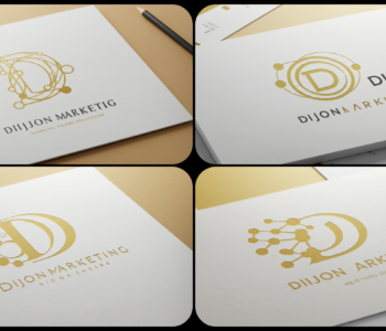
Using the Dijon Marketing logo as an example, you can see two distinct elements. The first is the circular icon resembling an uppercase cursive D. This is the logomark. The text to the right of that then would be considered logotype. The logotype can be as simple as a font, but usually involves some additional styling or flourish. In my logo, I use Roboto font with specific font weights, specific ratio of font sizes, and some additional kerning on the word “Marketing” for a more uniform width.
Do I need a logomark or logotype?
You certain can have a standalone logomark. Some of the most famous brands in the world do. Can you picture the logomark for Nike, Apple, or Target? The use of a logomark alone is best suited for well known brands. If you are just starting out, it may be difficult for people to recognize you without a logotype.
You can also have a standalone logotype. This is one of the most often requested when I start on a new logo design with a client. They most want just the name of their brand to be the logo. But I always say, “A font is not a logo.” You need a bit more than just choosing a font and a color if you’re going to go with only logotype.
The best of both worlds
The best solution in almost every case is a combination of a logomark and logotype. The logomark is iconic, bold, and recognizable. The logotype assists in new brands getting their name associated with the logomark. The other advantage is that you have the ability to create different sizes and combinations of the two elements for Responsive Logo Design. You can keep your branding regardless of the screen or print size you are dealing with.