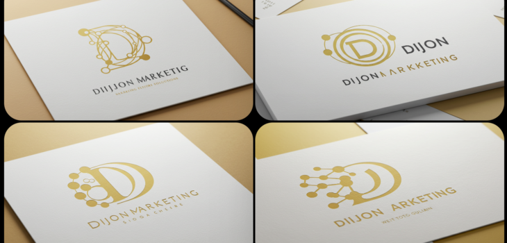
The Strategic Power of Font Pairing
In the digital world, your brand never gets a second chance to make a first impression. Before a potential customer even processes your headline, their brain has already formed an opinion about your business based on how your text looks.
Typography is the silent voice of your brand. It’s one of the most powerful—and often overlooked—tools in a marketer’s arsenal. But why exactly does choosing the right font matter so much, and how do you pair them without turning your layout into a design headache? Let’s break it down.
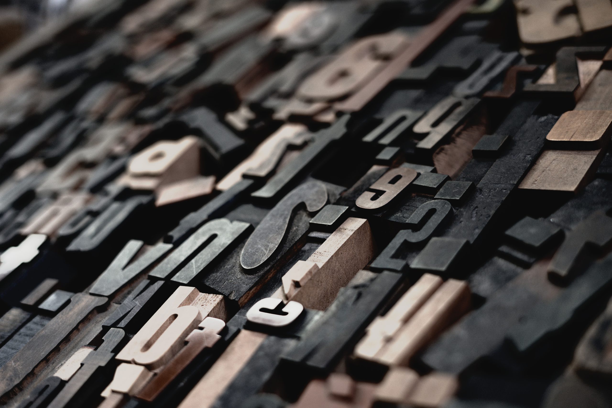
Why Typography Matters (Beyond Aesthetics)
Think of fonts as the “tone of voice” for your written content. A sleek, minimal font signals modernity and efficiency, while a classic serif can evoke trust, tradition, and authority.
When your font choices align with your brand identity, you achieve three critical marketing goals:
- Cognitive Fluency: When text is easy to read, the brain processes the information faster. High readability leads to higher engagement and better retention.
- Trust and Professionalism: Inconsistent or poorly chosen fonts can make a brand look amateurish or untrustworthy. A polished, cohesive typographic system signals that you pay attention to the details.
- Visual Hierarchy: You control the reader’s journey. By using different weights, sizes, and styles, you guide the eye exactly where you want it to go—from the hook in your headline to the call-to-action (CTA) button.
The Golden Rules of Pairing Fonts
If you want to create attractive, readable layouts, you don’t need to be a professional graphic designer. You just need to follow a few simple principles:
1. The “Rule of Three” (or Less)
Less is more. Using more than two or three fonts creates clutter and confusion. A common formula is to pick one display font (for headings) and one body font (for longer blocks of text).
2. Contrast is Key, Conflict is Not
You want your fonts to look different, but they need to share a “vibe.”
- Do: Pair a bold, punchy headline font with a neutral, highly readable body font.
- Don’t: Pair two fonts that are almost the same but slightly different. That creates “typographic mud”—it looks like a mistake rather than a design choice.
3. Establish Roles
Assign each font a job. Your header font is the “shouter” (the attention-grabber), and your body font is the “teacher” (the clear, informative guide). Never make them compete for attention.
The Design Pro’s “Easy Win”: The Super-Family
If you are intimidated by pairing fonts from different designers or foundries, here is your secret weapon: The Font Super-Family.
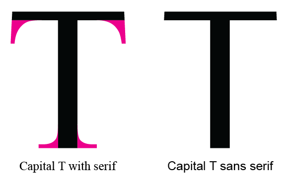
Many modern font families (like Roboto, Open Sans, or Merriweather) come in a massive array of styles, including both serif and sans-serif versions.
Why this is a designer’s secret weapon:
- Guaranteed Harmony: These fonts were engineered to share the same proportions, x-heights, and character widths. They are siblings, not strangers, so they will always look balanced together.
- Instant Professionalism: By using a serif for your headers and a clean sans-serif for your body copy (or vice versa) from the same family, you get the visual “contrast” that makes designs look expert-level, without the risk of the fonts clashing.
- Streamlined Workflow: You don’t have to hunt for hours trying to find a perfect match. You can simply look through the weights and styles available in your chosen family.